I like the "Expand featured" & "Jump to news" on mobile!
Thanks for adding those!!!
EarlG
(23,252 posts)We still have plenty of bug fixes to do but we're also trying to include small improvements here and there when we can. There were some concerns about the order of items on the new home page so hopefully those new buttons will help. Glad you find them useful!
Edited to add: the buttons only appear on home page when viewed on a phone, in case anyone is looking for them and can't find them.
CaptainTruth
(8,016 posts)I've done a fair amount of programming, & it seems like the "tweaking" never ends. There's always something you see that you want to do better.
Anyhow, you may recall my comments about how content was displayed on the previous mobile home page & this is so much better!
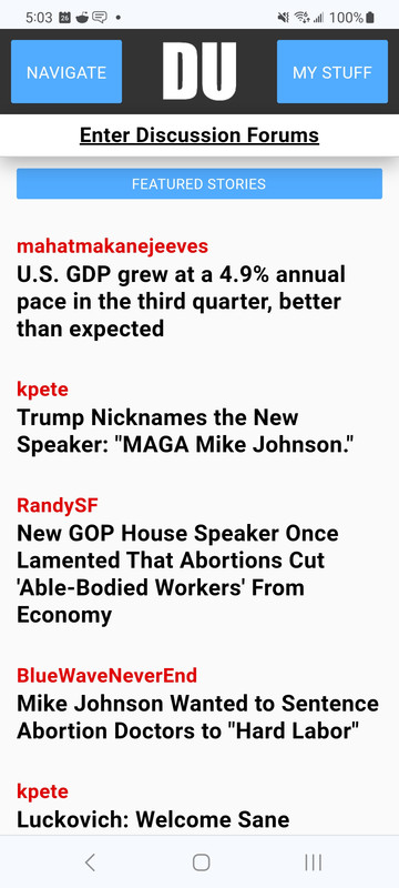
For reference, here's what it looked like before on my phone (Samsung Galaxy S20 Android 13):

Here's what it looks like now with Collapse featured:

MUCH better IMHO. THANK YOU!!!
And the jump to LBN is great too!
EarlG
(23,252 posts)Originally I wanted a way to feature those "Left Column" items ( now labeled "Featured Stories" ) more prominently on the mobile home page, but it wasn't until the home page got a wide release that I found out how important various other sections were to people.
I tried to come up with some tweaks that would hopefully resolve things for as many people as possible. Featured Stories is still up top, but I significantly shrunk down the amount of space they take up. The "Expand" button allows people who want to read the summaries to do so. Finally the "News" button allows people who want to go straight to those threads to do just that.
Glad you like it! Refinements and revisions will be ongoing for a while as we try to get everything in order.
CaptainTruth
(8,016 posts)I really like having Featured, Trending, & Greatest first, those are the things I always look at first, then I can navigate to anywhere else I'm interested in. Thanks for that!
Laura PourMeADrink
(42,770 posts)Have been busy so haven't explored DU4 much... But wondering about what you are saying. First think I notice is what seems like a zoomed in view. Are you saying that there's a correction to this? TIA

CaptainTruth
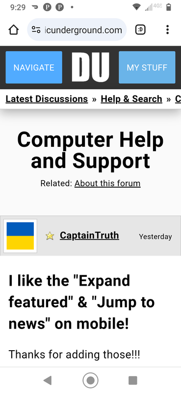
(8,016 posts)It was because in my Android Chrome browser I had Text Scaling set to 125%. Note that just increased text size, unlike Page Zoom which zooms in the view of the entire page.
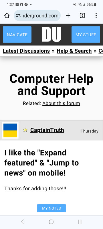
I took EarlG's advice & set my Chrome browser Text Scaling to 100% & turned on Large Fonts in the Settings on DU. That produced this view:

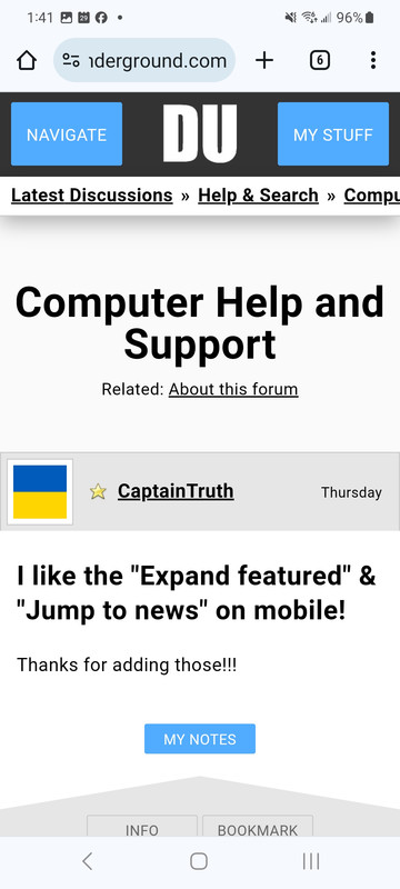
After using DU for a while like that, it looks like some of the font sizes changed, so I turned off Large Fonts in the DU Settings & now it looks like this:

I hope that helps!
Laura PourMeADrink
(42,770 posts)first thought... Change off large font. Which I did, and it looked the same. Like a zoomed in version of old DU.
I have a theory that successful sites keep everything extremely simplistic. Example has got to be drudge ( used to get exit polls before " they" ( whomever) said you couldn't publish. And drudge hates trump.
Anyway, the secret IMHO only, to its success is it's simplicity. They never tried to add pics and graphics and menus and features and colors - just puts out simple
list of hot stories with links.