Artists
Related: About this forumSheltieLover
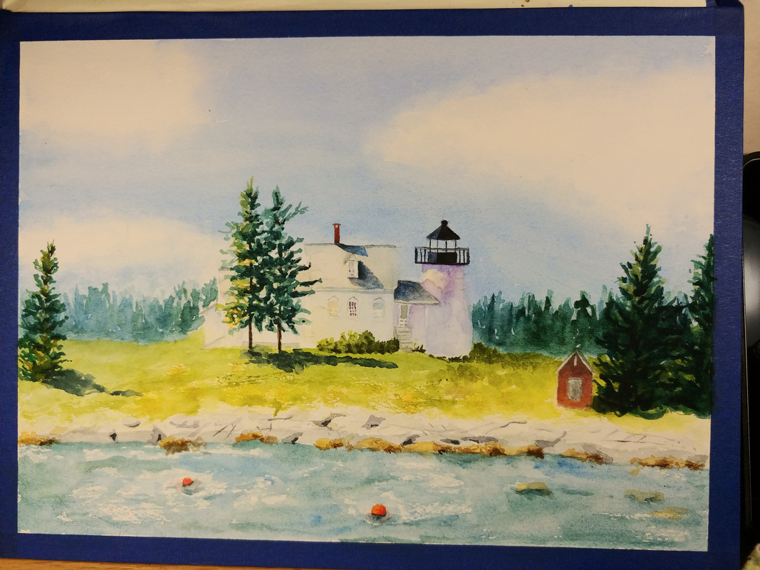
(59,605 posts)I think, possibly the house could still use some definition. Maybe outline the roof? Ty for sharing your lovely work!
Maybe a little more detail on the house, especially near the edge of the trees? Just my two cents. I think it's beautiful. Makes me want to be there!
lunatica
(53,410 posts)I really like that you have parts of it looking sharp, like the tops of the buildings, while others look a little less defined. It still has the atmospheric feeling about it so the viewer is aware of the air defining the glow of the light.
LiberalLoner
(10,107 posts)Struggle with painting trees and I would be so happy if I could do as well as you do!
The feeling of light in this painting is beautiful, it feels like such a bright summer day!
You did such a good job with the composition as well. Putting the main subject in the middle can be risky but you made it work by placing counterpoints to each side so the painting has wonderful flow!
femmedem
(8,444 posts)I wouldn't change a thing or add any more definition. That house is quite a distance from the viewer and the way it's painted now, it's bathed in light. If you added any more details you would risk losing the light and the sense of distance.
LiberalLoner
(10,107 posts)lunatica
(53,410 posts)I like that you made the changes very subtly. It has a lovely atmospheric feel to it.

